photo kime5_zps3df5231d.png  photo kime6_zpsa90859c6.png  photo kime7_zps9d2ef86d.png  photo kime9_zpsb23b4278.png
Showing posts with label unity stamp co.. Show all posts

Wednesday, September 30, 2015

Art Journal Layout Featuring Donna Downey Stencils

Hi friends! I'm popping in today to share a sample of an art journal page that we'll be creating in this weekend's "Art Journaling Made Simple" class. (Actual class samples will vary, but the techniques used on this page will be used.)

I have a few photos to share of some of the steps taken to create this journal spread. Contact me at ksdm@comcast.net if you have an interest in signing up for the October 3rd class, where we'll explore more quick and easy steps to creating your own beautiful art journal pages.

This spread started with Tim Holtz tissue wrap and Distress Paint. I love tissue wrap! It's a great starting point in art journaling.  The tissue was applied with matte medium and then Distress Paint was added on top. Don't mind that blue peeking through...these pages contained some extra paint from another product. That will be covered by the time I'm finished.


Next, I used Wendy Vecchi's embossing paste and the Flower Bed stencil from Donna Downey to add these beautiful, textured flowers to my page. The blue paint, any paint, will be absorbed by the paste so remember that if you want your paste to be pure white. No worries on my page as I painted my flowers.
My flowers were colored with paint and then shaded with Faber Castell Big Brush Markers. (I put the stencil back over the dry paste. This protected my background and allowed me to easily color all of the flowers and leaves without worrying about paint getting on the background). I did add a bit of stamping, used a cracked glass stamp from Tim Holtz, around the edges of the page, as well as a bit of aging on the page edges, using Potting Soil Archival Ink from Wendy (love that color!) And, of course, I had to add a few white splottie-dotties using watered down white gesso. The sentiment is actually from a Donna Downey stamp set, You Are Important, but the sentiment in the set was too small for my page so I used alphabet stamps to add the saying. 

Interested in learning more? Check out the details on my Art Journaling Made Simple class, coming up on Saturday, October 3...There's still time to register!
If you've been intrigued by the idea of art journaling or have recently jumped into this wonderful form of creating, but are overwhelmed by all that's involved...this class is for you! This class is perfect for beginners and intermediate students.

During our four hour class, we'll create three different art journal pages. I'll walk you through the steps taken to create beautiful, quick and easy backgrounds using a variety of mediums, such as Distress Paint and embossing paste. We'll also discuss which tools you'll need to produce the best results, along with providing you with a quick list of some of my favorite go to products. Lastly, I'll teach you how to create beautiful collages and art in your journals. 

Also during the class, I'll demonstrate a number of techniques, such as gesso resist and coloring pastes. We'll work with ink sprays, acrylic paints, Distress products, collage, embossing pastes, and stencils. Our goal for the day is not only to experiment, learn, and have fun, but to also show you how easy it is to create beautiful art work, quickly and easily! The added bonus? The class includes an 8"x5" Dylusions journal!

The cost for this class is $50.00. Please email Kim at ksdm@comcast.net to register, an electronic invoice will be generated once your request for registration has been received. A supply list will be sent once payment has been received. Please note that class fees are non-refundable after September 28, 2015. Registration will close on October 1, 2015...

Class location: Fremont, NH
Date: October 3 - Time: 1:00-5:00 pm
Cost: $50 (includes 8"x 5" journal)

Monday, September 21, 2015

If it doesn't challenge you...

Hi friends! I have a fun 8x10 canvas project to share with you today. This was a very simple project that came together in about an hour...grab your stamps and paint, and let's get started!

First, I want to share that I created this canvas piece to be a journal cover for my very first junque journal. Julie Fei-Fan Balzer teaches an online Junque Journal class, and I signed up for it last week. If you have tons of half painted papers hanging around your studio, you MUST sign up for this class! I was able to bind together almost 100 pieces of random papers into two journals. This is an amazing class given by an amazing teacher...Go sign up, just do it!

OK, back to our regularly scheduled program...
I started with a canvas panel from Dick Blick (you can buy these in bulk for short money, click here for the link), two Distress Paints (Wild Honey and Ripe Persimmon), and a water bottle.

I painted the top portion with the Wild Honey and the bottom with Ripe Persimmon. Then the entire canvas was spritzed with water (start at the top of the canvas). The Distress Paints react with water and beautiful mixing will take place...yummy. (I'm not sure why there are small open areas, where the paint didn't seem to cover completely, but I don't care...love the look!)
Next, I stamped this stunning, gigantic poppy image, from Donna Downey (You Are Important), on the canvas using VersaMark ink and embossing with Black Soot Distress Powder. Donna's stamps are perfect for art journaling and canvases because they are HUGE. This stamp is approximately 7" tall!
I painted the poppy image with more Distress Paint (Festive Berried and Abandoned Coral). I used a paint brush to apply the paint and then spritzed the still wet paint to get it to run outside of the lines of the flower. (Tip: When Distress Paint is dry it is permanent, it will not react with water so if you want the paint to flow, you must spritz while the paint is still wet.) After the paint was dry, I used a paint brush to outline the flower. Since I did the outlining by hand, vs. re-stamping the image, I got a nice painterly look. And now, for an important public service announcement...
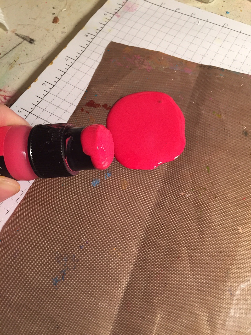
I've taken countless classes with Tim (Holtz), and during every class he reminds attendees to NOT squeeze the paint bottles. "Don't squeeze the bottles, don't squeeze the bottles..." And every time, someone squeezes the bottle and paint goes all over the place. I teach classes, and shoot videos, all the while saying, "Don't squeeze the bottle..." Guess what I did tonight? I squeezed the bottle... Don't be like me...and do not squeeze those darn bottles!
After I cleaned up that big 'ol paint mess, I added some stenciling to my canvas. (I used Wendy Vecchi's Archival Inks for all of my stenciling.) The leaf stencil is from Wendy Vecchi, Lovely Leaves, and the number design is the Mini Number Repeat from Donna Downey. 
For the final step, I added more stenciling, using Wendy's embossing paste and the Believe Script stencil from The Crafters Workshop. I stamped the sentiment, included in the You Are Important stamp set from Donna Downey, and added a touch of Potting Soil Archival Ink, using a blending tool, to the edges. The sentiment is a bit further to the right than normal because this is going to be a journal cover and the binding will cover up a portion of the left hand side of the canvas. As soon as I get the journal together, I'll take a video to share the goodness! Oh, and I did add just a few tiny splashes of Festive Berries paint to the entire canvas!

Friday, June 20, 2014

Overwhelmed with Amazingness

Guess what?  I suddenly have the ability to draw amazing faces...thanks to Donna Downey and her newest line of stamps, produced by Unity.  I can't even tell you how much I love these stamps and how amazing it is to be able to create an art journal page, featuring a face, quickly and easily.  Thank you Donna!!

This was a page that already had some orange Dylusions Ink Spray in the background (it was actually part of a "pick up the rest of that ink" page, with little else going on).  I have a bit of a reversed way to coloring these face stamps; I start by adding color before I stamp!  I used watercolors for this page and can I just share that I am in love with watercoloring.  I adore the look of the dried puddles of color...it's so delightfully imperfect...makes my heart skip a beat!  

So...color went down first, in just the general area of where the image would be placed.  I looked at the stamp, placed next to my page, to get a general idea of where the different colors would be placed.  I will note that I only put down one layer of color...no shading or much in the way of detail.  Next, I used Archival Ink to stamp the image.  You'll need Archival for any projects that include water.  I heat set the ink and started adding more shading and detail.  A white gel pen is perfect for the white of the eyes!  I also used a black Stabilo pencil to fill in any lines that weren't prominent and to add that sketchy look.  Once my piece was dry, I simply added the sentiment (included with the Anastasia Believes stamp set) and stapled on a torn tag with the date.  Seriously, half hour to finish the entire piece!

Check out our entire line of Donna Downey face stamps...there's something for every artist!  Oh, and these stamps are HUGE!  A whopping 5"x7", which is perfect for art journals!  Rock on!

Monday, November 18, 2013

Create Art


I had a little time to craft tonight and decided to try out the new Art Anthology Sprays that we recently brought into the store and this is what I came up with!  Below is a step-by-step guide to how I created my tag.  Be sure to read until the end of today's post for some exciting news!!

I started by grabbing a #8 manila tag and misted the tag with Timeless Art Anthology Spray and then I added just a hint of Guacamole.  Haven't never used these sprays before, I wasn't sure about the coverage or how they would react with water.  I found that they have a light, translucent, soft color and you can get full coverage by misting the colorant with water, which makes the spray very fluid.  I added a hint of water to my tag before drying with a heat tool.  I'm a fan of splatters so I wanted to leave some of those visible.
Next, I decided to see how the inks would react with water...you know all about how the Distress products react, right?  Well these behaved the same way!  Check out the great splats and drips I was able to achieve by adding misted water after the colorant was dry.  LOVE it!
After the colorant was completely dry, I grabbed the Burlap Layering Stencil, my all time fav Wendy Vecchi stencil, Classic Words, Scattered Straw and Wild Honey Distress Inks and decorated the background of the tag.
 Here's the tag with the Burlap stencil (I used Scattered Straw for the color)...
And here's the Classic Words stencil (using Wild Honey and a rather dirty blending tool, which explains the somewhat muddy color...but that's ok, I'm kind of a fan of the color of mud!)
Once that was done I started searching for the right image and I ended up grabbing one of the new Donna Downey faces from Unity (this is the She is an Artist).  I wanted to see how much of that giant image I could fit onto a tag...these are some seriously big stamps....they ROCK!
And here's the result after I stamped the image...SWOON!  I inked the stamp with Jet Black Archival Ink and then pressed the tag onto the stamp vs. flipping the stamp over and applying it to the tag.  This gave me more control over what part of the image ended up on the tag.
After I heat set the ink, I added some color to my artist's face by scribbling with Gelatos (I used Gelatos from the Neutrals, 50's Diner, and Green sets) and using my finger to blend the colors.  This allowed me to make her face stand out from the yellow background (and not be so yellow!), add some color to her cheeks, eyes, hair, and lips, and to add shading under her chin.  I also used a white pencil to trace the word 'artist' in her hair, so it would stand out, along with coloring in the whites of her eyes.  My last step was to add the words 'create art' from the Journal Words stamp set from Catherine Scanlon.
Interested in learning more about Art Anthology Colorant Sprays?  Join the owner and producer of Art Anthology products THIS Friday at eclectic Paperie's new studio in Exeter, NH.  Stayce DeWid will be visiting the studio on Friday, November 22 to host two technique-laden classes!  Class size is limited so register today!  Click here for full details!


Friday, February 1, 2013

Let Your Dreams Take Flight


Hey...have you heard?  Splitcoast has started a brand new mixed media weekly challenge!  Isn't that fabulous!!  I'm so excited that SCS has decided to venture into this wonderful new art...once you get started, you won't be able to stop!

And I'm even more excited that I had time today to make a card for the first challenge! Woot! Woot! The challenge this week was to combine paint and something shiney, such as embossing powder, metal, etc.  I decided to stick with acrylic paint and embossing powder.
 
I started by painting a piece of sticky back canvas with Adirondack acrylic paints.  I used what has become my fav color combo, Salmon and Terre Cotta.  I then added just a hint of Eggplant to the edges when I had finished.  (Know what is a great blending tool...besides your finger...a baby wipe!  Perfect for working in the darker color paint with the background colors!)
 
I then added a few bits of script from a much loved Tim stamp (from way back when!) and then I stamped my Hollyhock image with VersaMark ink and embossed with black embossing powder.  (That's my shiney element for the challenge!)
 
I stayed true to my love of all things CAS with my card, which can be a challenge with mixed media projects, but I'm learning and having fun experimenting. The background of my card base is embossed with an embossing folder and then I layered the canvas on another piece of white cardstock and popped up the entire main image with foam tape
 
I had a great time playing along with the challenge...why don't you give it a try?!  Enjoy!

Sunday, November 29, 2009

Keep it Simple Sunday

Today's Tip: Use one color of cardstock and embossing powder for instant glitz!
First, I have to apologize for my somewhat dark photo...for some reason the shine on the embossing powder made my cheapy digital camera flash freak out and every photo I took was washed out...too much flash! So I had to resort to desperate measures (seeing as I was taking my photo in the dead of night and there wasn't any hope of natural sunlight) and turn off my bright overhead lights to force my flash to behave! Anyway...the inspiration for tonight's card came from Mary Fish. I'm not quite sure how I stumbled upon Mary's blog but she is one seriously talented stamper and a recent member of the SCS Dirty Dozen. I was browsing through their latest gallery when I saw a wonderful card created by Mary. She had used only red cardstock and silver embossing powder, the results were fabulous! I went with a deep plum and had originally thought about going with a holiday theme but while looking through my stamps, I realized that my poor Unity stamps have been left alone for far too long! I belong to their Kit of the Month club and this cute typewriter image and sentiment is from their November kit. This is a small card, only 4"x 4", and after stamping and embossing the typewriter I realized I didn't have room for my sentiment. And that, ladies and...well....ladies (I've never had a gentleman visit my blog), is when a tiny bit of my own inspiration hit! I cut a slit into the top of the typewriter and inserted the sentiment so it looks like the typewriter is typing on the paper....Come on now...it's pure genius! Oh alright, having one good idea in years I should not brag about! LOL! One other thing about the card, that is difficult to see in the photo, is that the card base has a texture to it and the paper with the image does not. The difference is more obvious in person but I thought that, and adhering the image with dimensional tape, was a good way to add separation to the tone on tone affect. OK kids, enjoy your evening! I'll be back later this week with a fun scrapbook project to share!

Friday, August 14, 2009

Friend to Friend

Last night I had some free time for crafting and went I sat down to create I realized that I've been neglecting my Unity stamps lately. Shame on me!! I pulled out my July KOTM for this card. The kit includes some adorable images, such as a jeans pocket and trinkets to fill the pocket - so cute! I'm looking forward to using those images but last night I wanted something quick and easy to I chose this cute flower and vase image, which was colored with a few pale Copic colors (the colors are a bit darker in person but I guess my bright sunshine this morning washed out my colors...arrggghhh...). This is the first time, in a long time, that I've torn a piece of paper on one of my cards but thought this would be a way to add a little personality to the stamped area, along with a PTI button, aged edges with PTI Chai ink, and some faux stitching. I also used a few of the PTI background stamps on the kraft background but the Chai ink, which was very noticable when wet, faded quite a bit when dry. Kind of bummed me out but you can still make out some texture on the kraft paper. And instead of adding a big piece of ribbon I opted for wrapping some PTI twine around my card and securing in the middle with a tiny piece of PTI ripe avocado ribbon and more twine. The sentiment is from Unity's June KOTM. Enjoy and have a wonderful Friday!

Tuesday, July 14, 2009

I Have a Problem...

I can't stop using kraft cardstock and a white gel pen! I love it! For this card, I even dragged out the white ink! (PS - I used Paptreyink's white ink pad while at the Stamping Around CT event and it is divine! Go get yourselves one of those juicy ink pads...I know it's on my wish list!) This card is based on this week's Mojo Monday sketch, although it's now a MoJo Wednesday. Oh well, I did make the card on Monday evening, if that counts. :-) I love the the Mojo sketches, they're amazing! All images used are from Unity Stamp Co., my new fav stamp manufacturer. That little peek of patterned cardstock is from Basic Grey and my other cardstock and accessories are from Stampin' Up! Enjoy!!