photo kime5_zps3df5231d.png  photo kime6_zpsa90859c6.png  photo kime7_zps9d2ef86d.png  photo kime9_zpsb23b4278.png

Wednesday, May 30, 2012

Oooh La La

Round Two!  Here's the card I created for round two of the CAS DT try outs...and I think this might be my favorite of the three!  Our challenge was to use a picture of a shoe as inspiration.  Being as black is my favorite shoe color, I opted for the black and cream shoe.  Since fashion was our main theme I went looking for something fashion related and remembered my Tim Holtz dress form die cut!  Perfect!!

I started by adding two rows of black scallops (similar to the inspiration shoe) and a piece of embossed cream cardstock.  Then came the dress form, dressed up with a big 'ol bow and pearl.  Last came the sentiment from the To Paris With Love set from Sweet 'n Sassy.

My round three card has been submitted and we'll know the results on Friday...ohhh...it's gonna be a long wait!  But to distract me, I'll be crafting with Korin for the next few days!  Can't wait!!

Tuesday, May 29, 2012

Kindred Spirits

Guess what?  I decided to try out for the Splitcoast CAS design team again.  This time I've made it to the last round.  Talk about pressure to create something fabulous! LOL!  This is the card I submitted for the first challenge, which was to create a card with flowers.  Well...flowers...they're my favorite stamp so this was the easiest challenge for me.  (The next two challenges have make me think!)

For this card I decided to do some reserve masking.  I created my mask using an oval Nestibilities die and then filled the oval with Distress Ink and a blending tool.  (Distress Ink is perfect for blending as it stays wet longer than dye ink and the colors work together perfectly.)  Once the background color was done I very lightly (too lightly really, I wish it was a bit darker) stamped the Friendship Script stamp from Sweet 'n Sassy.  Next came the flowers and grass from the Serene Silhouettes set and finally a sentiment from the Together Silhouettes set.  Super quick and easy card and you can use this technique with any color or stamp combination.  Fun stuff!


Friday, May 25, 2012

My Happy Place


Quick card made last night for this weekend's Distress Marker class.  (Contact Wholly Scrap! for more details)  Jennifer McGuire posted a video on how she created an amazing rainbow card, using Distress Markers, and the minute I saw it I knew I had to use the technique on a card.   Since this was for a class I needed to simplfy so folks could finish in a reasonable amount of time so I created a narrow strip and used only one color family to create the honeycomb background (background stamp by Tim, of course!)
Once the background was colored with the markers, I added a boatload of Perfect Pearls mist...check out that shimmer!  The water from the Perfect Pearls makes the Distress Markers run...just a bit...which creates a great muted look.  Then I added this sweet bee image (a free digi from Paper Smooches), a trail from a Papertreyink ink stamp set and even a sneak peek of a sentiment from a soon-to-be-released Sweet 'n Sassy stamp set!  (The bee was colored with Copic, which provide a much deeper color than the Distress Markers)

Enjoy!

Wednesday, May 23, 2012

Beach Bum

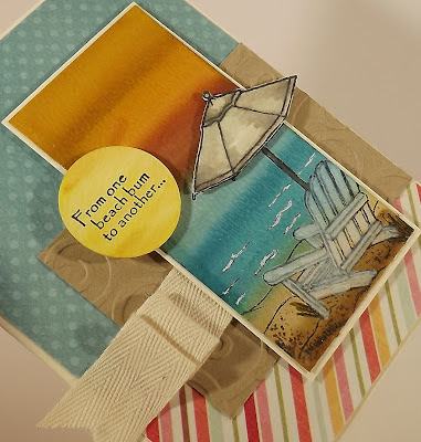
Did I tell you that I'm teaching a class this weekend, at Wholly Scrap!, where I'll be demonstrating how to use the new Distress Markers?  (But of course...I'm using all things Tim this week!)  This is one of the cards that we'll be making...love how it turned out and it came about by me simply playing around with the markers.  Isn't it fun when that happens?
I started by swiping markers across a small piece of watercolor paper and then I hit all the colors with a watercolor brush.  Since these markers react with water, the brush makes all of the colors blend together.  (When I was just playing around with the markers, I ended up loving two of the blue colors together...it reminded me of water.)

After I finishing laying down the background colors, I stamped this darling beach chair images on top with Memento ink.  This stamp, Ocean Paradise, is from Sweet 'n Sassy and it's one of my favorites!  Love the chair, the umbrella, and the sentiments.  I then stamped the umbrella again and colored it with markers before cutting it out and attaching with foam tape.  The chair was colored with the Picket Fence marker...love that!  The circle for the sentiment (isn't it like a sun??!!) got more Distress Marker color before being attached with foam tape.  The rest of the card is just paper and twill!!

Enjoy and if you're in the New England area and want to learn more about these great markers, contact Wholly Scrap! and sign up for my class!

Tuesday, May 22, 2012

The Graduate

So this past week we celebrated the graduation of someone I work with (hint, it's Donna-Marie!) and I offered to make a card for everyone at the store to sign.  Since Donna-Marie's degree is in fashion, I had to create a fashion-inspired card!  I used this fun set from Tim Holtz, called Haberdashery, to create the card.  (Forgive my slightly blurry photo...did not notice it until I downloaded the photos and by then the card had been already sent!  Better photo below!)


I started by stamping a few of the images, in Archival ink, on the background of the card.  I then colored the images with the new Distress Markers and used a watercolor brush to blend the colors.  I then added a few swirls, thanks to a stamp set from Papertreyink.  The dress form was stamped on a separate piece of paper (I used watercolor paper) and then added some Distress Inks to...distress the image. :-)  A tiny bit of Stickles were added to the top of the dress form.  I did the same thing for the spool top image (love that image!)  Before attaching the dress form I used Perfect Pearls to add some fabulous glitz to the background.  And then...and then...I created an animal print scarf by dying seam binding with Distress Inks and adding dark brown dots with a Copics marker.  (One of Donna-Marie's designs included an animal print wrap...)

Such a fun card to create!  Stop by and see Donna-Marie's designs and wish her a big congrats!

Monday, May 21, 2012

My Crafty Dreams...

have come true....That's right, I finally was the opportunity to take a class with Tim!!  Tim...sigh...my crafty crush.  Not only do I love Tim's style but I'm continually amazed by his level of creativity.  And it turns out that he is not only a great instructor but has a fantastic sense of humor.  He had the entire classroom laughing out loud numerous times.  It was such a memorable and fun experience! 
I attended the class with a few ladies that I've become friends with since working at Wholly Scrap!  The craft industry is seriously the most amazing industry out there.  It's such a treat to work with and around such creative and inspiring women (and a few men!)
Here's our classroom (the classes were held at Absolutely Everything), about 85 women attending a five hour class.  I thought I would be exhausted after five hours of creating but I honestly had a hard time leaving.  I was considering trying to sneak out to dinner with Tim and his friends but I was concerned that they would call security on the crazy stalker! LOL!
Here's the almost finished piece.  Each of those squares in a piece of grungeboard that has either been embossed, painted, stamped, sanded, etc.  Tim walked us through a bunch of techniques and I'm pretty sure we used every Ranger product available!  Not only is this a great piece of art but it serves as a reminder of techniques that we can use on future projects.

Ahhh....such a great time...

Thursday, May 17, 2012

Spellbinders Basket


A sweet little basket I created for an upcoming Spellbinders class at Wholly Scrap!  This was created using one of the large labels dies, which was scored in the middle with a 1" spine.  I added regular cardstock to hold the shape of the basket and then decorated with ribbon, designer paper, and a flower.  The handle was also created with a Spellbinders die!

Monday, May 14, 2012

Hugs to You


Hi there and welcome to Tuesday!  Today I'm sharing a tutorial in the Sweet 'n Sassy forum on using the new Distress Markers from Tim Holtz to watercolor an image.

Head on over and check out all of the details!

Friday, May 11, 2012

Give Me Paris


And somehow we're already at Friday again?  Just how does that happen so quickly?  (PS - The new Blogger format continues to make me cranky! LOL!)  Well I had the best of intentions of posting every day this week and here I am with just my third post!  I think I need an assistant...yeah, that's it...I'll talk to my husband about that...

Today's card is a sample from an upcoming card class I'll be teaching at Wholly Scrap!  During the class we'll be playing with the new Distress Markers.  Has anyone tried them yet?  What do you think?  I haven't tried every technique with them but I really liked how they worked when coloring on stamps, which I did for this card.  I used a few colors to color directly on the butterfly stamp (from Tim) and then stamped on Prism smooth cardstock.  I then spritzed the paper with Perfect Pearls and added some Walnut Stain Distress Ink to the edges.  Kept the card layout simple, the background is embossed, and I only added the Paris half circle and a few pearls.  It's good and sparkly in person.  I'm looking forward to creating a few more cards using the markers. 

Enjoy!

Wednesday, May 9, 2012

Happy Father's Day


I have a card posted on the Sweet 'n Sassy blog today!  Head on over and check out all of the details!

Monday, May 7, 2012

Say it with Letters - Wooden Eiffel Tower Project


I have a new Say it with Letters project and a tutorial over on the SIWL blog!  Head on over and check out all of the details on creating these unique wooden creations!

Thursday, May 3, 2012

Sweet 'n Sassy Release Day


It's release day again at Sweet 'n Sassy and I'm so excited to share this month's stamps and cards with you!  We have a great release, blog hop, and party planned for you that is full of fun, prizes, and lots of creativity!  Make sure to join us at 8:00 pm for our release party on our Splitcoast Forum.  We always have a wonderful time and we'll be posting lots of challenges and all of the new stamp sets!

My cards feature the new sets Timeless Classics (seen above) and Wedding Cake (seen below).  For my Father's Day card (and PS - I am simply crazy about the fonts included in this set!) I used wonderful vintage paper from Graphic 45 in the background and then created my own patterned paper by stamping the gear image multiple times on white cardstock using VersaMark ink.  I then embossed with clear embossing powder and added color with Distress Inks.  The embossed area resists the ink to showcase the stamped images.  The truck was colored with Copics, keeping the colors simple so stay with that vintage feel.  I then added a few stars from the Star Die Set.

For my wedding cake card I used some new stunning paper from Teresa Collins.  I just picked this up last week and couldn't wait to use it!  I like the blue and yellow color combo for a wedding...so summery!  I simply stamped the lovely cake image on white cardstock and colored with Copics.  The sentiment is stamped on a paper ribbon and I added a big 'ol frame of pearls to showcase that pretty dragonfly paper and image.  I also added a little sparkle to each of the flowers with Stickles.

I hope you've enjoyed today's cards and now you can check out the rest of the design team's beautiful artwork!  Don't forget to stop by the release party tonight and if you leave a comment on each of the blogs on our hop, you'll be entered into a drawing to win the ENTIRE release!  Yippee!!
Kim Schofield - YOU'RE HERE!


Tuesday, May 1, 2012

With Sympathy


It hasn't been often (thankfully) lately that I've needed a sympathy card but when I received word that a former work collegue had passed away it was time for me to create a card to express my condolences to the family.  It's always nearly impossible to know what to say or to find the right words that will bring some measure of comfort but sometimes I think it's best to say little.  With that in mind, I knew I wanted to create a very serene and simple card, with a short sentiment on the front with room to write more inside the card. 

I decided to check out Michelle Zindorf's tutorials because I knew I wanted a main image that featured trees.  If you've never been to Michelle's site, I encourage you to check it out!  She is an amazing artist!  I found a tutorial that would work for my card and got to work!

I used the Through the Trees stamp set from Papertreyink.  To create the reflection I used a stamp positioner (stamp the trees on the slick side of the Stam-A-Ma-Jig plastic, turn it over on your paper and rub gently...perfect reverse image!)  I did use a lighter ink color for the reflection, a deep blue.  This will keep your image from looking like a reflection.  Then using the stamp positioner again, I stamped the upright trees in black ink.  Then I got to work with my blending tool and ink!  Note that I don't use a brayer when I create these cards because I stink at using a brayer!  LOL!  Instead I use a blending tool, from Ranger, and Distress Inks, which are amazing for blending multiple colors.  One my background color was applied, I tore a piece of paper and used a dark ink to create the definition between the trees and the reflection.  Then I used used a white gel pen for some highlights and added the sentiment.  I kept the rest of the card very simple as the main image is able to stand alone.


And now to get this card in the mail...