photo kime5_zps3df5231d.png  photo kime6_zpsa90859c6.png  photo kime7_zps9d2ef86d.png  photo kime9_zpsb23b4278.png

Saturday, April 16, 2016

Inspiration Wednesday - Week 6

Well it only took six weeks for me to get way behind on my IW videos and posting...oh boy! And it also took six weeks for me to hit the "they can't all be winners" creation. LOL! This layout, although very simple, took the most time to create. Those darn flowers were tricky!

However, in the end, I found that I was mostly happen with the final results. The flowers, which were created with Wendy Vecchi's embossing paste, started as white, then blue, then back to white again before ending up as gold. I do really love the look of the gold against the dark blue background.

My page ended with some cork letters, aren't they fun, and a few sentiment stickers. Next week I'll share week 7, which came together much faster and easier. Hey, they can't all be winners, but keeping a journal filled with all of our art, not just the very best, is a satisfying experience. I love looking back on older projects and seeing how my techniques have evolved or improved. It's a great keepsake...like a diary packed full of color, texture, and artistic growth!

Enjoy!

Thursday, April 7, 2016

Playing with Tim Holtz Woodgrain Cardstock

Hi folks! I'm back with another new product review...Tim Holtz Woodgrain Cardstock. The new cardstock comes in a pack of 12 pre-cut sheets (5.5" x 4.25") of heavy cardstock embossed with a woodgrain texture. Very convenient! The pages are white right out of the package. Here's what I created with my first sheet...

This piece of cardstock involved lots of layers, which started with Distress Paint in Tea Dye and Bundled Sage. I added the paint and then spritzed the paper with water to blend the colors. It already looked pretty good here!

Next I added a few Distress Stain colors to get more of that patina look. I used Peacock Feathers and Peeled Paint for this second layer.

And just because I was curious about the new Mica Sprays (this one is from the Dylusions line), I spritzed a fine mist of mica spray over the cardstock. It's not screaming bling, but adds just the finest mist of shimmer. Love it!

As I was digging through my bin of paint I stumbled across the Tarnished Brass Distress Paint and was compelled to add a tiny bit of brass paint to the edges...dreamy.

I finished by adding Gathered Twigs and Black Soot Distress Inks. Conclusion? The woodgrain cardstock is a blast, and it take stand up to just about anything you throw at it!

Next I stamped a butterfly, from a Dina Wakley stamp set (see supply list below), onto a piece of a gelli print I had in my stash. (I did glue the deli paper to a piece of cardstock for more stability) Then I grabbed my new Dylusions White Paint Pen and added some highlights...The new paint pen is dreamy! You need it! It took a while for the paint to work its way down to the tip of the pen, but after that it worked amazingly well, better than the Sharpies I have in my stash. This white pen is going into my stash of favorite pens!
I finished my card by using the new cabinet cards from Tim Holtz, along with a sentiment and a few Idea-ology stickers (upper right hand corner). And, of course, I needed a tiny bit of bling...'cause butterflies must have a sparkly trail, right? 

And in other, very exciting news, I was asked to join the 2016 The Crafters Workshop design team! I can't wait!! The term doesn't begin until the May time frame, but be sure to stay tuned for lots of great stencil projects!!


Monday, March 28, 2016

Playing with Distress Crayons

Of the products that were released during this year's CHA, Distress Crayons (yes, I bought every color!) were one of the products I was most excited to try. My CHA pre-orders from The Funkie Junkie arrived a few weeks ago, and I finally had an opportunity to play with the new crayons.

Since I was just trying them out I opted to grab a tag and apply a few different colors. Here's what I found...

1) They blend better on paper with your fingers vs. a water brush. The water brush didn't really move the color around that well once it was applied to the tag.
2) Using a baby wipe gives you amazing blend-able results.
3) Laying a stencil over the colored tag and then removing some of the color with a baby wipe is divine!
4) The colors blend really well together without becoming too muddy. (You can even blend two colors together for a third color!)
5) The crayons are super creamy and applying more pressure produces deeper colors and better final results.
6) Final verdict? Super fun product, can't wait to use them in my art journals!

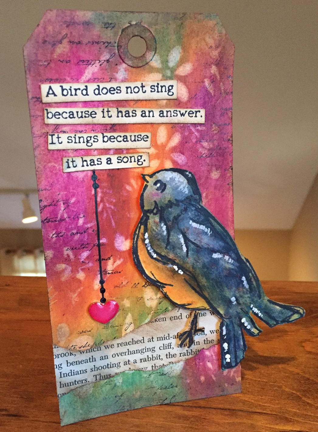
For this tag, I scribbled a few crayon colors directly onto the tag, and blended slightly with my finger. A laid a stencil over the tag and then used a baby wipe to rub some of the color off of the tag. You're left with this beautiful watercolor look. I then used a script stamp and jet black archival ink to add some stamping to the background.

The bird is from Dina Wakley's Scribbly Birds stamp set (see product links below), and I again used the crayons to add color to the bird, just blending with my finger.

Vintage text paper gave my bird a "branch" upon which to perch, and the sentiment (from the same stamp set) was stamped on a tag, cut out and attached with liquid glue. That teeny heart is another one of my favorite CHA releases...Wendy Vecchi's Mat Mini Hearts! Oh man, I love these heart! Super thick chipboard that is simply inked with Wendy's Archival Inks, then a hint of glossy accents added for some great shine.

Hope you enjoyed today's project...now go out and grab yourself some Distress Crayons! Here's where you can shop for these products...

Supplies:

Friday, March 18, 2016

Inspiration Wednesday - Week 5

Hello strangers! Sorry for the long absence from my blog. I actually have a lot to share, just haven't had a lot of time to write and upload photos. Hard to find time for everything lately as I have some big news, which the quote included in my week five Inspiration Wednesday project kind of alludes to...
Get ready because it's a doozey! We're moving back to NH! That's right...our time in CT is to be short lived. We don't have a specific time frame yet as we need to find a home, but my hubby starts a new job in a few weeks.

This certainly wasn't part of our plans. I mean who moves state-to-state twice in six months?! That's craziness! And I'm still trying to wrap my brain around it, but it seems to be the way that things have worked out. (Unless there's another plot twist around the corner...oh man, I hope not!) 

Long story short, the new job here wasn't working out. My husband loved the work, but there were some other issues that were unable to be resolved. We knew that a job change was in the near future, but we didn't know how near. He was contacted by someone he interviewed with over the summer, who is now ready to hire. It's a great opportunity and I'm so excited for him! Of course this means we need to go through the entire moving process again, but I couldn't be happier! I'll dearly miss some folks we've become friends with in CT, but I feel that we're returning to our home. And I suspect that we'll be back in CT for many vacations in the coming years...

Now on to this week's project!
This was a tough week for me...I reworked these pages a bunch before I was happy. Donna had used a giant number stencil on her page, but I didn't have anything similar so I went with the heart texture stencil (from Donna Downey), which didn't work quite as well as the letters were a little small.

There are many layers of paint on these pages...paint, glazing medium, more paint, and a new product from Finnabair, Thick Modeling Paste.
Once my many layers were dry I added a hint of black by using a few Crafters Workshop stencils. My favorite part of this project are the tiny bits of teal showing through on the pages and the heart. Oh, I used a 3D Gloss Gel for the heart, which is a new Prima product. Want step-by-step instructions for creating a similar project, check out Donna Downey's Inspiration Wednesday videos. It's only $35 for 25 classes! Interested in supplies I used? Check out the links below:

Supplies:
-Prima Art Basics (3D Gloss Gel and Thick Modeling Paste)

Thursday, March 3, 2016

Jumping on the Bird Crazy Bandwagon

I've finally done it..given in to the Bird Crazy craze! If you don't know about these fun bird images then where have you been for the past two years?! LOL! I fought it long and hard, but I finally found myself too drawn to these silly faces to resist any longer...

Tim Holtz introduced the Bird Crazy stamp set probably two years ago, maybe less, and the demand for them took off like mad. He then introduced coordinating dies and accessories. And now I see these birds on craft blogs all over the internet land!

When these were first released, I still owned eclectic Paperie and I honestly had a hard time keeping the stamps and dies in stock...it was madness! Once I started the closing process, I managed to tuck one stamp set and one die set into my stash...you know, just in case. Almost a year later...I finally pulled them out to create a card for my son's upcoming birthday. (I think this bird is has a slight resemblance those Angry Birds so I know my son is going to love this card!)

My card began with a healthy dose of Wendy Vecchi's embossing paste and a Dina Wakley stencil. Once the paste was dry I added some water and applied ink from Tim's Distress Markers. Adding more water made the ink from the markers run in between all of the non-paste surfaces...dreamy. (I used Ranger watercolor paper for this process)

My bird was stamped on another piece of watercolor paper and die cut. More markers, with a non-stick craft sheet and water brush, were used to color the bird. The dies, which perfectly fit around the birds eyes and beaks, were used to cut out those features and pop them up with foam tape. Bring on the dimension! To finish the card I simply added a vintage text circle and some words from a Chit Chat sticker book.

So there you have it..my introduction to this super fun stamp set! Want to give using these birds a try? Click any of the links below to go directly to the product pages. (The Funkie Junkie sells these products for 20% below retail!)

Happy Crafting!

Supplies:


Thursday, February 25, 2016

Inspiration Wednesday - Week Four

Welcome to week four of Inspiration Wednesday! This week's lesson focused on keeping things simple, and this has to be one of my favorite layouts to date. I adore the white text surrounded by little bits of gold...it's the perfect accent to the one colored pages. Divine... (If you read the text on my pages you'll see it's from an old history book on China, the Soviet Union, and other nations. It's probably a fascinating read...and no doubt makes for strange crafting materials! LOL!)

I started by attaching my book pages to my art journal with matte medium. I then created a whitewash, using gesso and water, to brush across all of the pages.

My next step was to apply gold paint, I used Dina Wakley's Gilt paint on these pages, to all of the edges. I also went over all of the edges with Gathered Twigs Distress Ink.
The small mailing tag is one that I had in my stash and I simply added a date stamp, inked the edges, and attached some twine and a heart. The tiny heart is from the new Wendy Vecchi Mat Mini - Hearts collection. Her mat minis are shapes die cut from an extremely strong chipboard that can handle paint, ink, heat embossing...anything! I just cover this one with gold paint, applied with my finger, which gives it a nice textured look.

The gold letters were in my stash, and following a tip from Donna Downey, I painted the sheet of letter stickers with gesso and then gold paint. What do you know...gold stickers! What a great idea!
I decided to include a photo this week...call it a combination of scrapbooking and mixed media art journaling! This is a photo I printed out a few years ago and it's just been collecting dust waiting for me to use it in a project. I can't think of anything better than including my sweet Bean in an art journal spread. (You know what's funny? This photo is from a mini golf course in CT..not far from our new home. I can't believe we ended up moving to the same town where we took a vacation three years ago...Crazy!)
This week's lesson included lots of layering, which is love, and so I added lots of layers behind the photo. This is a great way to use up paper and ribbon scraps, pieces of tags, tissue paper, and I even threw in some punchanella that I found in a bin. The little forever banner was a paper banner that I painted with more gold paint. I stamped the word on using tiny alphabet letters. My last step was to add just a few gold paint splatters...'cause every good art journal pages needs paint splatters!

Happy Crafting!

Tuesday, February 23, 2016

Clean and Simple (CAS) Cards Featuring Sweet 'n Sassy Stamps

Hello crafty friends! I'm popping in with a few quick and simple cards that I created last week, featuring stamp sets from Sweet 'n Sassy.

Now that we're in a new state and attending a new church, I've been making cards for the few people that we've gotten to know, in an effort to connect with and make new friends. (Friendship bribery via homemade cards...perhaps, rabbit...LOL!)

Last week we had two big occasions...one sad and the other joyful, such is our common experience during our lives. One woman lost her husband, after 60 years of marriage, and a new baby was born to one of the church's families. Since I don't know either family very well, I thought I'd send a card for each. (There is a folder set up in the church for each family so I can just drop a card into the correct folder...pretty neat!)

Since I needed two cards, and since this girl is short on time lately, I opted to keep both designs simple. I even used almost the same layout on each. And with any CAS card...keeping things clean, white, and bright is a great option.

My first card features an older Sweet 'n Sassy stamp set, Rose Collage. This set includes the rose collage image, along with two butterflies, and a host of sentiments that fit perfectly inside the ribbon image included in the collage. I stamped the image on watercolor paper and then used Distress Markers to color the image. This is the first time I used a deep purple for the shading...and I love it! It seems to give much more depth vs. a black or gray color. For more depth, the butterflies were stamped on a scrap piece of paper, colored, fussy cut, and attached to the main image. Then I just cut out the image, leaving a small white border, and used foam tape to attach to the front of the card.

The second card showcases the sweet Little One stamp set that includes a darling hand and feet image along with a baby carriage, a rattle, a few heart images, and a host of new baby-inspired sentiments. After cutting four small squares (1.25"), I used watered down paint to add some paint splatters, and then added the silhouette images to each square. I left the fourth square empty so I could attach the sentiment. The squares were added to layers of designer paper and attach to the card front. This card got a tiny bit of bling in the form of tiny pearls. I also added a few score lines at the bottom of the card for visual interest.

I hope you enjoyed both of today's cards and are encouraged to embrace the clean and simple design..it makes for a joyful card creating experience!

Happy Crafting!