I found a brand new (new to me) challenge last week and I had to play along! It's the Mixed Media Place challenge, found it from following a link on France Papillon's blog (she's an insanely talented mixed media artist), and this month's challenge was to create a 3-D project.
I picked up a Prima clock months ago, along with a whole bunch of embellishments, and have had an idea on what I wanted to create for a while. The MMP challenge made me spring into action as I realized I now had a "reason" to start this project! (Why is it that we sometimes need a deadline to start and/or finish making art!)
I really liked the original finish of the clock...old metal...but I wanted to add either some dimension or additional color. I wasn't really sure what direction my paint brush would take me so I decided to start with vintage book pages...you can never go wrong with vintage text! Here's what my clock looked like after adding the text...

I just added random torn pieces of book paper, all edged with Gathered Twigs Distress Ink and applied with Multi-Medium Matte finish. Once the glue was dried, I painted over the entire piece with a combination of Wild Honey and Rusty Hinge Distress Paint. Humm...wasn't loving the look...the colors were too bright for me. I added a hint of Polished Brass Distress Paint and then I called it a night. (I forgot to take a photo of this step!) When I got up the next morning and looked at the clock...I knew I had to cover the paint. The color was all wrong...so I started to lightly add a layer of Beach Hut PaperArtsy paint. The Beach Hut paint is slightly translucent so I could still see a bit of the other paint colors and the shimmer from the Brass paint was dreamy. I started with light coats of the Beach Hut paint, knowing I could add more. Here's the next coat of paint:

Isn't that dreamy? Now I was getting the look that I wanted. The text got a bit covered up by the layers of paint, but I really like the texture that the paper gives to the clock. Now, you know I couldn't not add some brown to the clock so I got busy with Wendy Vecchi Potting Soil Archival Ink. I needed Archival Ink, not Distress Ink, as I was going over acrylic paints. I added the ink to all of the edges of the clock and any raised areas...
The addition of the Potting Soil ink really adds to the age and depth of the paint. I adore it! (Need to try this same technique on a canvas!)
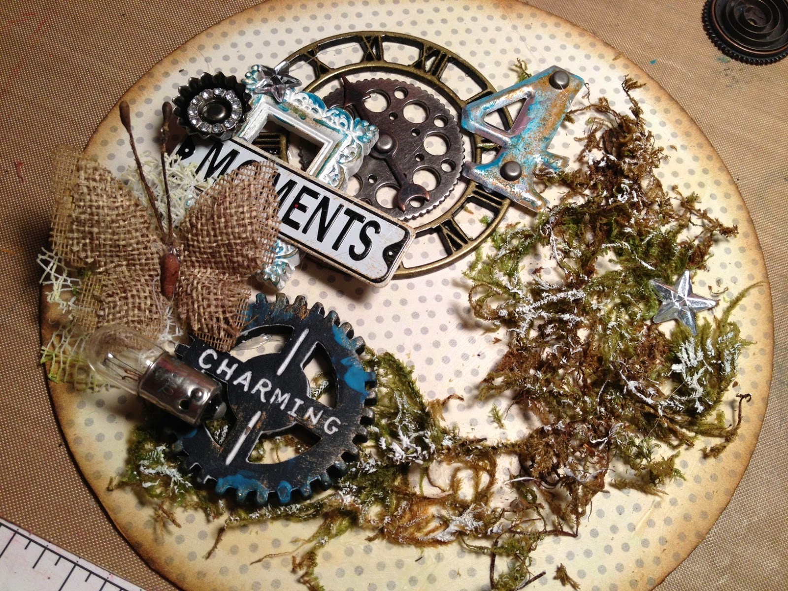
The nice thing about the clock is that the entire back can be removed so you can work on a flat surface..just like a card or mini canvas! I added a whole bunch of embellishments, layering them all before I got busy with my glue gun. I also added tiny bits of moss to the background and paint flecks on some of the metal pieces. (Oh, I started by gluing down a piece of designer paper). Here's the finished inside of the clock:
I knew that I was going to use a cut out photo of my boys as the centerpiece of the clock so I placed the photo on the clock back and then laid out the embellishments around the photo. This helped me put everything into the correct spot and that's why the right hand side of the circle only has the moss...the photo will be standing in front of the moss.
Next I re-attached the clock back, added the photo cutout (my photo was printed on a matte, heavy weight cardstock), and got to work on the outside of the clock. I added a bunch of metal embellishments (all colored with Teakwood Alcohol Ink so they would all be the same color), painted flowers, and moss to finish the decorations. Below are some more close up photos of the outside:
I love the tiny bird nest...so cute and it works perfectly with the moss and mesh flower petals. The metal swirls on top of the clock are lots of fun too!
I used a large metal swirl to add as a platform for the flowers (and burlap flowers are the perfect pairing with photos of sweet boys!) and once the flowers were attached, I hot glued the entire piece to the clock. A few metal pieces, and these sweet resin gears from the Prima are the bomb! The tiny hot air balloon is from a chipboard set, also Prima, that I've had in my stash for months. Here's another view, looking inside the clock:
I'm just giddy about how this turned out and this piece is just perfect on our fireplace mantle (as shown in the first photo of this post). I think my hubby is going to add a tiny light on the inside of the clock so that you can peek in to see all of the decorative goodness inside...of course my darling boys are the best part of the entire piece!! Love those smoochie-boys!