photo kime5_zps3df5231d.png  photo kime6_zpsa90859c6.png  photo kime7_zps9d2ef86d.png  photo kime9_zpsb23b4278.png

Wednesday, June 25, 2014

Be Fearless

Today I'm sharing a project that I created during a class with Dina Wakley, which I attended last year.  The focus of the class was on understanding color, an area where I struggle with when it comes to art journaling, which makes me giggle since I have no issues with this when it comes to card making.  I think much of has to do with me being so darn excited about creating journal pages that I grab way too much stuff and struggle with knowing when to stop applying color, design, and layers!  WooHoo!

During the class, Dina talked about the color wheel and using colors that complimented each others and those that were on opposite sides of the color wheel (if you don't have a color wheel, get one, it's really a helpful tool!)  We created a bunch of color combinations in the beginning of the class before we started working on the journal pages.  We created two pages and this one has become one of my favorites...I love the background color and contrast of the deep blue.  Hey, I did it...two color families and a neutral!  Yippee!

 
We started by using deli paper (get some of this stuff, it's awesome!), paint, and stencils to create a sheet of patterned paper.  Once that was dry, we cut out random shapes; since I'm a fan of circles, that's what I went with.  Then we created the background of the journal page, using a contrasting color.  (Orange and blue are on opposite sides of the color wheel).  I used only colors next to each other on the color wheel to create the background colors (yellow, red, orange).  Once the color was dry on the page, then I added the deep blue/purple circles (again, colors that are next to each other on the color wheel).  Then it was time to add additional designs and neutral colors.  Black is my favorite neutral as it really pops on a page.  I used paint in a bottle with a pointed tip to draw the fern image and write the words "be fearless" and a watercolor pencil to draw around the circles.  I then cut out text paper to fill in the leaves.  Lastly, I just added some stenciling.  Again, using black and my background orange color.  (Oh, and I added some tiny white dots 'cause I like dots!)

This was a really fun project...learning to play with color is great stuff!  Grab a color wheel, art journal, stencils, and some paint and experiment...be fearless!  (Product supply below)

Supplies:
Dylusions Art Journal
Acrylic Paint
Classic Words Stencil (from Wendy Vecchi)
Various Crafters Workshop Stencils

Monday, June 23, 2014

eclectic Paperie and Add a Little Dazzle Blog Hop


Welcome to our joint blog hop with Add a Little Dazzle. We are so excited to partner with them and have had so much fun playing with their products.  They have a beautiful collection of metal sheets, in a variety of colors, that are perfect for mixed media projects. Both design teams have combined our products and are ready to share some inspirational projects with you. Join in on the fun and make sure to enter for a chance to win an amazing prize.
Welcome to Day 1 of  the Eclectic Paperie & Add a Little Dazzle joint blog hop! We’re so excited to be sharing some fabulous creations featuring the wonderful products from both companies in today’s hop. We have two amazing days of inspirational projects so make sure to stop by tomorrow.

First we’d like to share a little bit about the two companies…


eclectic Paperie is a different breed of craft store, conceived as more than just a place where you can purchase supplies, we believe in the strength of collaboration, in coming together and sharing with like-minded crafters. Our goal is to offer a mixed media marketplace where a generation of artists can congregate, explore, imagine, and inspire one another.

Add a Little Dazzle specializes in an exclusive line of craft metal sheets that helps you take your crafting to the next level. Whether you are a seasoned or new crafter, our craft metal sheets will help you create unique projects that will make you stand out among the crowd. Are you ready to take your crafting to the next level? Add a Little Dazzle Craft Metal Sheets will help you turn the ordinary into the extraordinary.

Prize Alert!

Make sure to stop by and visit each of the Design Team Blogs for a chance to win 1 of 2 prize packages from eclectic Paperie and Add a Little Dazzle  valued at $25.  You have until Friday, June 27th to enter.  The winners will be announced on both blogs on Saturday, June 28th.  You must leave a comment on all blogs.

   Are You Ready for Some Amazing Inspiration?
I had the opportunity to play with Add a Little Dazzle metal sheets and few months ago and I fell in love with their product!  The sheets are super easy to cut, emboss, and paint (among a million other things!)  And I love how many colors are available.  For my project, I decided to create a canvas and wait until you see the transformation of where I started and where I ended up! And...eP is now carrying a variety of metal sheets, you can find our offering here!

My first step was the cover a canvas board with torn vintage book paper (this paper is from the 1800's!).  I attached the paper using matte medium.  I think added white embossing paste through a stencil (this one is called Echoes).
Then I got all crazy and added some paint and sprays from Art Anthology, which I really liked but...I took one too many steps, adding another stencil design with some Art Anthology paint, and while I loved the beautiful paint colors, I was not happy with the design...too busy! 
So...I applied gesso and acrylic paint over the entire surface (when in doubt, just add gesso!)  The embossing paste AND the Art Anthology paints, which are dimensional when dry, added amazing texture.  I added aqua and grey paint, leaving some of the white gesso showing.
Next, I used more white gesso and another stencil (Tim's Schoolhouse layering stencil) to add some white to the background.  Some watered down Art Anthology paint (in Fairy) was perfect for adding some splats.  (And the Art Anthology paint dries glossy so the matte/glossy contrast is great!)  I added some black Archival Ink, using a blending tool, around the edges.
I then used more of that book text, mounted on chipboard, to create a base for my photo.  A piece of black cardstock, with more of the Schoolhouse stenciling, was my second layer.  Before adding the photo (yes, that's me on the right at about six years of age, with my mom and brother) I added a big 'ol green drip.
Then I got to work with my metal sheets.  I first die cut the flower shape with an older Tim Holtz die and embossed the flowers using an embossing folder.  I used Tim's "flower making method" to create the layered rose.  I used black paint to go over the embossed flower (before assembling) and then used a paper towel and sanding block to remove some of the paint.  I also used a greenery die to cut out all of the leaves from a white metal sheet and covered some of the leaves with Inka Gold (Green/Yellow).  The metal sheets are so easy to work with and adding little bends creates a more realistic flower/leaf.

All that was left was assembly!  I used glue dots to attach all of my metal pieces to the canvas and they seem to be holding beautifully (the metal is very lightweight).  You could also use a hot glue gun.  The sentiment is a portion of a Tim Holtz saying, which I just stamped on a manila tag, cut out and attached with Glossy Accents.
That's it for my project!  Ready for more?  Check out each of the links below, which will take you to members of the eclectic Paperie and Add a Little Dazzle design team blogs. And don't forgot to leave a comment on each blog so you'll be entered into the prize drawing for a $25 gift certificate, given away by each company!!  Enjoy!!

Friday, June 20, 2014

Overwhelmed with Amazingness

Guess what?  I suddenly have the ability to draw amazing faces...thanks to Donna Downey and her newest line of stamps, produced by Unity.  I can't even tell you how much I love these stamps and how amazing it is to be able to create an art journal page, featuring a face, quickly and easily.  Thank you Donna!!

This was a page that already had some orange Dylusions Ink Spray in the background (it was actually part of a "pick up the rest of that ink" page, with little else going on).  I have a bit of a reversed way to coloring these face stamps; I start by adding color before I stamp!  I used watercolors for this page and can I just share that I am in love with watercoloring.  I adore the look of the dried puddles of color...it's so delightfully imperfect...makes my heart skip a beat!  

So...color went down first, in just the general area of where the image would be placed.  I looked at the stamp, placed next to my page, to get a general idea of where the different colors would be placed.  I will note that I only put down one layer of color...no shading or much in the way of detail.  Next, I used Archival Ink to stamp the image.  You'll need Archival for any projects that include water.  I heat set the ink and started adding more shading and detail.  A white gel pen is perfect for the white of the eyes!  I also used a black Stabilo pencil to fill in any lines that weren't prominent and to add that sketchy look.  Once my piece was dry, I simply added the sentiment (included with the Anastasia Believes stamp set) and stapled on a torn tag with the date.  Seriously, half hour to finish the entire piece!

Check out our entire line of Donna Downey face stamps...there's something for every artist!  Oh, and these stamps are HUGE!  A whopping 5"x7", which is perfect for art journals!  Rock on!

Wednesday, June 18, 2014

Wendy Vecchi Large Stamp Storage Binder

Looking for a great storage idea for your Wendy Vecchi stamp sets?  Look no further than the Large Stamp Storage Binder!  Wendy introduced these amazing binders, created using her famous art parts material (aka the heaviest chipboard you've ever seen), her new stamp, stencil, and art journal covers are the perfect solution for storing all of your Studio 490 products (or for creating an awesome journal!)
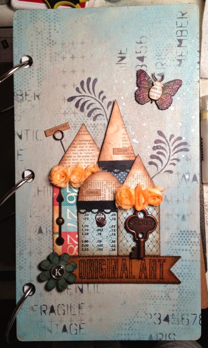
 Here's my cover, in all it's decorated glory!  I confess that I didn't take step-by-step photos but I'll share my process below.
  • Start by adding color to the binder base.  I used a combination of Distress Paint (Tumbled Glass) and Perfect Pearls mist.  I like to add the paint and then spritz with water to make the paint even more fluid.  I just used my fingers to spread the paint around and to get rid of all any lines.  The Perfect Pearls were lightly misted over the piece once the paint was dry.
  • I used a few stencils (Tiny Circles, Add a Stencil, and Classic Words) to add more design.
  • My little houses were created using an older Tim Holtz die.  I just use scraps of designer paper and dictionary pages for the roofs.
  • The houses were decorated using stamps, Vintage Mesh and Pricing Chart.  Of course all edges were aged with Gathered Twigs Distress Ink (the best and only brown ink in my book!)
  • All of the little metal pieces and ribbons on my houses were just odds and ends that I had left over from other projects.  The little words are from the Chit Chat sticker set.
  • The banner and flower are left over Art Parts from the Banners and Just Flowers sets.  I just colored with Distress Inks and stamped a sentiment with Archival Ink.  (The butterfly was already created and in my stash).
  • Before I attached all of my pieces, I stamped that two fab swirls (the My Kind of Art has great swirls) to act as smoke coming from my imaginary chimney.
And how about the storage available in these binders?  Check out how many sets are in my binder...and there's room for a few more!
If you're looking for a beautiful storage option for your Wendy Vecchi stamps I can highly recommend her new storage binders.  And it's sure to be the prettiest storage solution on your shelves!!

Enjoy!

Monday, June 16, 2014

Dylusions Ink Sprays - A Quick and Easy Art Journal Page

I created a quick and easy art journaling inclusion using Dylusions Ink Sprays and stamps by Dina Wakley and Wendy Vecchi (oh, and a sweet little tag created by my oldest son...).

I created a video to document my process and to show you how easy it is to create simple backgrounds with ink sprays.  Watch the entire video below: